A realistic carpet texture is more than a photograph placed on a rectangle. It needs believable scale, surface detail, thickness, fibre direction and lighting. When those parts agree, the rug belongs in the interior. When they do not, even a high-resolution image can look like a printed sheet lying on the floor.
For most interior projects, the best approach is to match the material method to the camera distance. Use a well-scaled texture for broad room views, add controlled bump or normal detail for middle-distance views, and introduce fibre geometry only where a close camera can see it. This keeps the scene efficient while giving the rug the detail the presentation actually needs.
Start with the real rug, not the shader
Identify the product or material you are trying to represent. A flat-woven cotton rug, a tightly knotted wool carpet and a deep shag have different structures. They should not share the same thickness, surface response or edge treatment just because their colours are similar.
Collect a full view, a close view and an edge photograph. Record the finished dimensions and, if available, the pile height. Observe whether the surface is matte, gently lustrous or strongly directional. A photograph taken against the pile may look different from one taken along it.
The Ambiente's textured rugs, flat weaves and hand-knotted rugs can help you study these differences. Product images are references for understanding a material; downloading and redistributing them as a texture asset requires the appropriate permission.
Decide whether you need a tiled material or a complete rug map
A tiled carpet texture repeats a small area across a surface. It is useful for continuous carpet, a plain woven material or a procedural base. A complete rug map shows the whole design, including borders, corners and medallions. It belongs to one rug with known proportions.
Do not tile a complete decorative rug photograph across the object. You will create repeated borders and multiple medallions that do not exist in the product. Instead, fit the full artwork to the rug's UV space and use separate fine detail for the fibres.
Conversely, do not stretch a tiny fibre swatch across a large floor without checking scale. The weave may become enormous. Treat the decorative pattern and the microscopic surface as two different layers, each with its own physical dimensions.
Build a reference sheet with measurements
Create a small reference sheet containing the rug's width, length, thickness, dominant colours and construction. Include the source of each image and the permission or licence under which you can use it. This helps both the visualisation and the eventual specification.
If the design is illustrative rather than an exact product, state that in the presentation. A client may interpret a realistic render as a promise of a specific weave, colour or border. Clear labelling prevents a concept texture from becoming an unintended purchasing commitment.
For custom projects, link the reference sheet to the approved brief. Our guide to how custom rugs are made explains why dimensions, materials and design approval need to remain connected.
Photograph a sample carefully
Use even, diffuse light when capturing a colour reference. Keep the camera close to perpendicular to the surface and include a known measurement. Avoid a strong shadow from the phone or a bright reflection that becomes baked into the image.
Take additional photographs in angled light to understand depth and fibre direction. Those are valuable references, but they are usually unsuitable as a neutral base-colour map. A shadow photographed into the colour layer will remain there even when the render's light comes from another direction.
Crop only after you have corrected the perspective. If a sample is photographed at an angle, its apparent weave spacing changes across the image. A rectangular crop does not fix that distortion. Check that straight edges and repeat intervals remain consistent before creating the final map.
Separate colour from surface relief
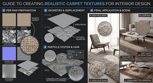
The base-colour map describes the material's colour. A normal or bump map suggests small surface changes. A displacement map moves the rendered surface, depending on the software and geometry settings. These maps perform different jobs and should not be treated as interchangeable.
For example, a dark floral motif may be dyed into a uniform-height wool surface. Making every dark pixel a deep valley would invent a carved design. If you need relief, derive it from real structural information or deliberately authored height data, not simply from colour brightness.
Use data maps with the colour-space setting appropriate to your renderer. In many workflows, normal, roughness and height maps should be interpreted as data rather than display colour. Check the official manual for the software and version you are using before wiring them into the material.
Establish believable scale first
Set the object to the intended rug dimensions before adjusting the texture. If the rug is 240 by 300 centimetres, build or scale it accordingly in the scene's unit system. Then fit the decorative map without changing the product's proportions.
Check the design against nearby furniture. A floral repeat that looks correct in the material preview may become much too large beside a chair leg. Use a familiar object in the test scene so you have a visual measurement reference.
The rug size guide can support your layout decisions, but it cannot supply the dimensions of an unspecified product. Use actual measurements wherever the render is intended to show a purchasable rug.
Give the rug an edge and a foundation
A perfectly thin plane rarely convinces in a close view. Model a modest thickness consistent with the product, add a small edge treatment and place it in proper contact with the floor. The silhouette contributes to realism even when the surface texture is subtle.
Study whether the edge is bound, wrapped, woven or finished with fringe. Do not add a generic fringe to every rug. It can imply a construction that the real product does not have, and a large copied fringe can distract from an otherwise accurate scene.
For a hand-tufted reference, the underside may differ from a knotted foundation. The difference usually matters only if the camera reveals it, but the visible edge should still reflect the actual object. Our construction guide is useful background for choosing a sensible model.
Use fibre geometry selectively
For a wide room render, detailed strands across the entire rug can consume resources without changing the image noticeably. Start with the simpler material. Add curves, hair or fur when the camera is close enough to resolve the fibres or when the silhouette needs visible softness.
Blender's official documentation describes the Principled Hair BSDF as a physically based shader for hair and fur. It provides controls for colour and roughness variation. Use the current manual to understand which rendering features your setup supports.
Chaos documents V-Ray Fur controls such as density and directional maps. These tools can support carpet-like surfaces, but their settings must be calibrated to the reference. A fur preset is a starting point, not proof that a rug has been represented accurately.
Match the geometry to the construction
For a flat weave, focus on small woven relief and a restrained edge. For a short pile, use a dense but subtle surface response. For a shag reference, longer strands may be necessary, especially at the perimeter and in raking light.
Avoid making every strand point straight upward with the same length. Controlled variation can help, but excessive randomness turns a carefully made carpet into unstructured fur. Observe the reference before deciding how much variation to introduce.
Furniture contact should also be believable. A sofa foot should not hover above the pile, and strands should not visibly pass through a heavy table base. Where the camera can see the contact, consider a local adjustment or a simplified contact zone rather than a complicated simulation across the whole rug.
Use roughness and sheen with restraint
A carpet surface usually reads through many small fibres rather than one large mirror-like reflection. If highlights resemble polished plastic, revisit roughness, the lighting setup and any sheen controls supported by the material model.
Do not use gloss to stand in for quality. A matte wool carpet can be highly refined, while a highly reflective surface can be a poor match for the reference. Look at the rug from several camera directions to check that shading changes remain plausible.
A lustrous blend may need directional treatment, but the exact response depends on the real material and the renderer. Keep the colour reference stable while you test lighting. Changing colour, gloss and exposure simultaneously makes it hard to identify the cause of an unrealistic result.
Hide repetition without changing the product
For tiled materials, examine the texture over a large area. A distinctive tuft, stain-like patch or diagonal shadow can become obvious when repeated. Remove lighting artefacts and repair seams before using the tile in the final scene.
Small variation in roughness or fibre direction can reduce an overly uniform appearance. Keep it subtle. Randomly rotating a directional weave may create a different material, while shifting decorative colours can misrepresent an approved product.
For a complete rug design, preserve the pattern's layout. If you need a different aspect ratio, discuss whether the design is being adapted or merely represented. Stretching a border to fill the object can distort motifs and give the client a misleading impression of the finished rug.
Test the material in two lighting conditions
Create a neutral test with soft daylight and a second view with light arriving at a lower angle. The neutral view reveals colour and overall scale. The angled view reveals thickness, relief, contact and unwanted repetition.
Keep exposure comparable when reviewing revisions. If every version uses a different brightness or contrast, material decisions become unreliable. Save the same camera and lighting positions so you can compare the effect of one change at a time.
Also test at the final output resolution. Detail that looks attractive in a large viewport may become noisy or disappear in a smaller client presentation. Render a crop of the rug at the intended delivery size before spending time on a full interior render.
Common problems and practical fixes
| Problem | Likely issue to investigate | First adjustment |
|---|---|---|
| The rug looks like a sticker | Missing thickness and contact | Model an edge and check floor placement |
| Fibres look oversized | Texture or geometry scale | Compare with measured reference |
| Pattern looks distorted | Incorrect UV proportions | Fit the complete design to the rug dimensions |
| Surface looks plastic | Reflective response or lighting | Revisit roughness and highlight size |
| Repeated patches stand out | Tile contains distinctive artefacts | Repair the tile before adding variation |
| The rug floats beneath furniture | Object and pile contact | Check heights and local intersection |
Treat this as a diagnostic table, not a list of universal numeric settings. Different software, unit systems and render engines require different values.
Choose assets with a usable licence
Poly Haven's licence page states that its assets are released under CC0. That can make it a useful source of supporting texture and lighting assets. You still need to verify that the particular downloaded material is appropriate for your visualisation.
Other libraries and retailer photographs may have different conditions. Record the licence for each asset and keep it with the project. The right to show an image in a mood board is not automatically the right to distribute it inside a reusable texture pack or a client scene file.
Questions designers often ask
Do I need an 8K carpet texture?
Only if the image framing and output require it. Correct scale, light and surface structure can matter more than a higher pixel count.
Can a normal map replace shag fibres?
It can suggest relief on a flat surface, but it cannot reproduce a visible long-fibre silhouette in every close view. Use geometry where the silhouette or camera distance makes it necessary.
Should I use a real product photograph?
It can help when you have permission and can obtain a suitable image. For a purchasing presentation, identify whether the result shows the exact product or a concept approximation.
How do I keep render times manageable?
Build the simplest convincing version first. Add detailed geometry only in visible areas and evaluate it at the final camera distance.
A useful delivery standard
Deliver the render with a short material note: product or concept name, dimensions, reference source and any approximations. Keep the texture maps, licence records and scale information organised with the scene. This makes the visual both convincing and useful when the project moves from presentation to specification.