Brown Rugs with Beige Sofas: Colours, Sizes and Styling Ideas. A practical guide to rug styling in Indian homes.
Understanding the colour
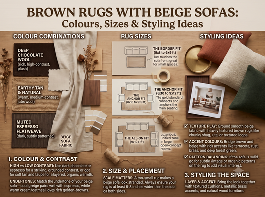
A beige sofa is versatile, but a room with only pale neutrals can feel flat. A brown rug adds warmth and helps define the seating area. The best shade depends on whether your beige fabric leans cream, yellow, peach or grey.
Matching furniture and flooring
Camel and caramel rugs pair naturally with warm cream sofas. Taupe gives a softer, cooler transition and chocolate brown delivers stronger contrast. If your floor is also brown or beige, look for enough difference in shade or pattern so the rug does not disappear into the flooring.
Choosing a balanced design
For cushions and curtains, use warm white, olive, rust or charcoal as controlled accent colours. Traditional patterns can add texture to otherwise plain furniture. A restrained geometric rug can make an elegant combination with modern sofas and clean-lined coffee tables.
Rug placement and sizing
Measure the seating arrangement before choosing a rug. At least the front sofa legs often sit on the rug to connect the furniture visually, though the precise layout depends on room dimensions. Compare medium-size rugs and large-size rugs after measuring.
Material and care
Material matters for everyday use. Wool is widely valued for texture and resilience, while silk-like fibres can have a reflective appearance and may need more delicate maintenance. Read the instructions for your specific rug and check whether spills or heavy traffic are frequent in your home.
Shop the collection
Browse brown rugs and carpets and living room rugs at The Ambiente. Check detailed photographs and actual dimensions. Brown may be a secondary tone in a multicolour rug, so review the selected product rather than relying on its tag alone.
Common questions
Frequently asked questions: Must the rug be darker than a beige sofa? No, a lighter tonal rug can also work. Can a brown rug suit a modern room? Yes, depending on its pattern and styling. Can a dark rug make a room look small? Dark tones add visual weight, which can be balanced with lighter furnishings and natural light.
Detailed styling and buying guide
Why beige and brown complement one another
When planning why beige and brown complement one another, begin with the real room rather than a studio photograph. The relationship between brown and beige is influenced by natural light, furniture proportions, the rug's construction and nearby finishes. Look closely at the room's floor and architecture, because undertones can become more obvious when materials sit next to each other. A design that appears understated in isolation may become the centre of attention beneath a sofa or bed. Compare several full-room photographs and close-up textile details before deciding which direction feels coherent.
Measure the exact area the rug should cover and consider how people move around the furniture. Try marking the intended outline on the floor using removable tape. This makes it easier to see whether the rug anchors the seating arrangement or feels disconnected from the main pieces. Material also affects the result: wool often reads softly textured, while fibres with sheen may reflect light and make a shade seem different from another angle. Always check the listed size, fibre composition, care instructions and actual product pictures instead of relying on a category name.
For a practical styling test, place photographs or samples beside your upholstery during the day and again after switching on evening lights. Consider whether the rug should add contrast, echo existing colours or introduce texture to an otherwise simple palette. Keep busy patterns in balance: if curtains and cushions already have a prominent design, a quieter rug can provide visual rest. If the furniture is plain, thoughtful patterning may make the arrangement feel richer. Aim for a comfortable, usable home, not simply a coordinated catalogue image.
Warm beige versus cool greige
When planning warm beige versus cool greige, begin with the real room rather than a studio photograph. The relationship between brown and beige is influenced by natural light, furniture proportions, the rug's construction and nearby finishes. Look closely at the existing furniture, because undertones can become more obvious when materials sit next to each other. A design that appears understated in isolation may become the centre of attention beneath a sofa or bed. Compare several full-room photographs and close-up textile details before deciding which direction feels coherent.
Measure the exact area the rug should cover and consider how people move around the furniture. Try marking the intended outline on the floor using removable tape. This makes it easier to see whether the rug anchors the seating arrangement or feels disconnected from the main pieces. Material also affects the result: wool often reads softly textured, while fibres with sheen may reflect light and make a shade seem different from another angle. Always check the listed size, fibre composition, care instructions and actual product pictures instead of relying on a category name.
For a practical styling test, place photographs or samples beside your upholstery during the day and again after switching on evening lights. Consider whether the rug should add contrast, echo existing colours or introduce texture to an otherwise simple palette. Keep busy patterns in balance: if curtains and cushions already have a prominent design, a quieter rug can provide visual rest. If the furniture is plain, thoughtful patterning may make the arrangement feel richer. Aim for a comfortable, usable home, not simply a coordinated catalogue image.
Choosing camel and caramel rugs
When planning choosing camel and caramel rugs, begin with the real room rather than a studio photograph. The relationship between brown and beige is influenced by natural light, furniture proportions, the rug's construction and nearby finishes. Look closely at the room's floor and architecture, because undertones can become more obvious when materials sit next to each other. A design that appears understated in isolation may become the centre of attention beneath a sofa or bed. Compare several full-room photographs and close-up textile details before deciding which direction feels coherent.
Measure the exact area the rug should cover and consider how people move around the furniture. Try marking the intended outline on the floor using removable tape. This makes it easier to see whether the rug anchors the seating arrangement or feels disconnected from the main pieces. Material also affects the result: wool often reads softly textured, while fibres with sheen may reflect light and make a shade seem different from another angle. Always check the listed size, fibre composition, care instructions and actual product pictures instead of relying on a category name.
For a practical styling test, place photographs or samples beside your upholstery during the day and again after switching on evening lights. Consider whether the rug should add contrast, echo existing colours or introduce texture to an otherwise simple palette. Keep busy patterns in balance: if curtains and cushions already have a prominent design, a quieter rug can provide visual rest. If the furniture is plain, thoughtful patterning may make the arrangement feel richer. Aim for a comfortable, usable home, not simply a coordinated catalogue image.
Dark chocolate rugs with pale sofas
When planning dark chocolate rugs with pale sofas, begin with the real room rather than a studio photograph. The relationship between brown and beige is influenced by natural light, furniture proportions, the rug's construction and nearby finishes. Look closely at the existing furniture, because undertones can become more obvious when materials sit next to each other. A design that appears understated in isolation may become the centre of attention beneath a sofa or bed. Compare several full-room photographs and close-up textile details before deciding which direction feels coherent.
Measure the exact area the rug should cover and consider how people move around the furniture. Try marking the intended outline on the floor using removable tape. This makes it easier to see whether the rug anchors the seating arrangement or feels disconnected from the main pieces. Material also affects the result: wool often reads softly textured, while fibres with sheen may reflect light and make a shade seem different from another angle. Always check the listed size, fibre composition, care instructions and actual product pictures instead of relying on a category name.
For a practical styling test, place photographs or samples beside your upholstery during the day and again after switching on evening lights. Consider whether the rug should add contrast, echo existing colours or introduce texture to an otherwise simple palette. Keep busy patterns in balance: if curtains and cushions already have a prominent design, a quieter rug can provide visual rest. If the furniture is plain, thoughtful patterning may make the arrangement feel richer. Aim for a comfortable, usable home, not simply a coordinated catalogue image.
Taupe and walnut variations
When planning taupe and walnut variations, begin with the real room rather than a studio photograph. The relationship between brown and beige is influenced by natural light, furniture proportions, the rug's construction and nearby finishes. Look closely at the room's floor and architecture, because undertones can become more obvious when materials sit next to each other. A design that appears understated in isolation may become the centre of attention beneath a sofa or bed. Compare several full-room photographs and close-up textile details before deciding which direction feels coherent.
Measure the exact area the rug should cover and consider how people move around the furniture. Try marking the intended outline on the floor using removable tape. This makes it easier to see whether the rug anchors the seating arrangement or feels disconnected from the main pieces. Material also affects the result: wool often reads softly textured, while fibres with sheen may reflect light and make a shade seem different from another angle. Always check the listed size, fibre composition, care instructions and actual product pictures instead of relying on a category name.
For a practical styling test, place photographs or samples beside your upholstery during the day and again after switching on evening lights. Consider whether the rug should add contrast, echo existing colours or introduce texture to an otherwise simple palette. Keep busy patterns in balance: if curtains and cushions already have a prominent design, a quieter rug can provide visual rest. If the furniture is plain, thoughtful patterning may make the arrangement feel richer. Aim for a comfortable, usable home, not simply a coordinated catalogue image.
Brown rugs on cream marble floors
When planning brown rugs on cream marble floors, begin with the real room rather than a studio photograph. The relationship between brown and beige is influenced by natural light, furniture proportions, the rug's construction and nearby finishes. Look closely at the existing furniture, because undertones can become more obvious when materials sit next to each other. A design that appears understated in isolation may become the centre of attention beneath a sofa or bed. Compare several full-room photographs and close-up textile details before deciding which direction feels coherent.
Measure the exact area the rug should cover and consider how people move around the furniture. Try marking the intended outline on the floor using removable tape. This makes it easier to see whether the rug anchors the seating arrangement or feels disconnected from the main pieces. Material also affects the result: wool often reads softly textured, while fibres with sheen may reflect light and make a shade seem different from another angle. Always check the listed size, fibre composition, care instructions and actual product pictures instead of relying on a category name.
For a practical styling test, place photographs or samples beside your upholstery during the day and again after switching on evening lights. Consider whether the rug should add contrast, echo existing colours or introduce texture to an otherwise simple palette. Keep busy patterns in balance: if curtains and cushions already have a prominent design, a quieter rug can provide visual rest. If the furniture is plain, thoughtful patterning may make the arrangement feel richer. Aim for a comfortable, usable home, not simply a coordinated catalogue image.
Brown rugs on wooden floors
When planning brown rugs on wooden floors, begin with the real room rather than a studio photograph. The relationship between brown and beige is influenced by natural light, furniture proportions, the rug's construction and nearby finishes. Look closely at the room's floor and architecture, because undertones can become more obvious when materials sit next to each other. A design that appears understated in isolation may become the centre of attention beneath a sofa or bed. Compare several full-room photographs and close-up textile details before deciding which direction feels coherent.
Measure the exact area the rug should cover and consider how people move around the furniture. Try marking the intended outline on the floor using removable tape. This makes it easier to see whether the rug anchors the seating arrangement or feels disconnected from the main pieces. Material also affects the result: wool often reads softly textured, while fibres with sheen may reflect light and make a shade seem different from another angle. Always check the listed size, fibre composition, care instructions and actual product pictures instead of relying on a category name.
For a practical styling test, place photographs or samples beside your upholstery during the day and again after switching on evening lights. Consider whether the rug should add contrast, echo existing colours or introduce texture to an otherwise simple palette. Keep busy patterns in balance: if curtains and cushions already have a prominent design, a quieter rug can provide visual rest. If the furniture is plain, thoughtful patterning may make the arrangement feel richer. Aim for a comfortable, usable home, not simply a coordinated catalogue image.
Cushion colours for beige sofas
When planning cushion colours for beige sofas, begin with the real room rather than a studio photograph. The relationship between brown and beige is influenced by natural light, furniture proportions, the rug's construction and nearby finishes. Look closely at the existing furniture, because undertones can become more obvious when materials sit next to each other. A design that appears understated in isolation may become the centre of attention beneath a sofa or bed. Compare several full-room photographs and close-up textile details before deciding which direction feels coherent.
Measure the exact area the rug should cover and consider how people move around the furniture. Try marking the intended outline on the floor using removable tape. This makes it easier to see whether the rug anchors the seating arrangement or feels disconnected from the main pieces. Material also affects the result: wool often reads softly textured, while fibres with sheen may reflect light and make a shade seem different from another angle. Always check the listed size, fibre composition, care instructions and actual product pictures instead of relying on a category name.
For a practical styling test, place photographs or samples beside your upholstery during the day and again after switching on evening lights. Consider whether the rug should add contrast, echo existing colours or introduce texture to an otherwise simple palette. Keep busy patterns in balance: if curtains and cushions already have a prominent design, a quieter rug can provide visual rest. If the furniture is plain, thoughtful patterning may make the arrangement feel richer. Aim for a comfortable, usable home, not simply a coordinated catalogue image.
Curtains that work with earthy rugs
When planning curtains that work with earthy rugs, begin with the real room rather than a studio photograph. The relationship between brown and beige is influenced by natural light, furniture proportions, the rug's construction and nearby finishes. Look closely at the room's floor and architecture, because undertones can become more obvious when materials sit next to each other. A design that appears understated in isolation may become the centre of attention beneath a sofa or bed. Compare several full-room photographs and close-up textile details before deciding which direction feels coherent.
Measure the exact area the rug should cover and consider how people move around the furniture. Try marking the intended outline on the floor using removable tape. This makes it easier to see whether the rug anchors the seating arrangement or feels disconnected from the main pieces. Material also affects the result: wool often reads softly textured, while fibres with sheen may reflect light and make a shade seem different from another angle. Always check the listed size, fibre composition, care instructions and actual product pictures instead of relying on a category name.
For a practical styling test, place photographs or samples beside your upholstery during the day and again after switching on evening lights. Consider whether the rug should add contrast, echo existing colours or introduce texture to an otherwise simple palette. Keep busy patterns in balance: if curtains and cushions already have a prominent design, a quieter rug can provide visual rest. If the furniture is plain, thoughtful patterning may make the arrangement feel richer. Aim for a comfortable, usable home, not simply a coordinated catalogue image.
Wall colour combinations
When planning wall colour combinations, begin with the real room rather than a studio photograph. The relationship between brown and beige is influenced by natural light, furniture proportions, the rug's construction and nearby finishes. Look closely at the existing furniture, because undertones can become more obvious when materials sit next to each other. A design that appears understated in isolation may become the centre of attention beneath a sofa or bed. Compare several full-room photographs and close-up textile details before deciding which direction feels coherent.
Measure the exact area the rug should cover and consider how people move around the furniture. Try marking the intended outline on the floor using removable tape. This makes it easier to see whether the rug anchors the seating arrangement or feels disconnected from the main pieces. Material also affects the result: wool often reads softly textured, while fibres with sheen may reflect light and make a shade seem different from another angle. Always check the listed size, fibre composition, care instructions and actual product pictures instead of relying on a category name.
For a practical styling test, place photographs or samples beside your upholstery during the day and again after switching on evening lights. Consider whether the rug should add contrast, echo existing colours or introduce texture to an otherwise simple palette. Keep busy patterns in balance: if curtains and cushions already have a prominent design, a quieter rug can provide visual rest. If the furniture is plain, thoughtful patterning may make the arrangement feel richer. Aim for a comfortable, usable home, not simply a coordinated catalogue image.
Modern minimalist brown rugs
When planning modern minimalist brown rugs, begin with the real room rather than a studio photograph. The relationship between brown and beige is influenced by natural light, furniture proportions, the rug's construction and nearby finishes. Look closely at the room's floor and architecture, because undertones can become more obvious when materials sit next to each other. A design that appears understated in isolation may become the centre of attention beneath a sofa or bed. Compare several full-room photographs and close-up textile details before deciding which direction feels coherent.
Measure the exact area the rug should cover and consider how people move around the furniture. Try marking the intended outline on the floor using removable tape. This makes it easier to see whether the rug anchors the seating arrangement or feels disconnected from the main pieces. Material also affects the result: wool often reads softly textured, while fibres with sheen may reflect light and make a shade seem different from another angle. Always check the listed size, fibre composition, care instructions and actual product pictures instead of relying on a category name.
For a practical styling test, place photographs or samples beside your upholstery during the day and again after switching on evening lights. Consider whether the rug should add contrast, echo existing colours or introduce texture to an otherwise simple palette. Keep busy patterns in balance: if curtains and cushions already have a prominent design, a quieter rug can provide visual rest. If the furniture is plain, thoughtful patterning may make the arrangement feel richer. Aim for a comfortable, usable home, not simply a coordinated catalogue image.
Traditional patterned brown rugs
When planning traditional patterned brown rugs, begin with the real room rather than a studio photograph. The relationship between brown and beige is influenced by natural light, furniture proportions, the rug's construction and nearby finishes. Look closely at the existing furniture, because undertones can become more obvious when materials sit next to each other. A design that appears understated in isolation may become the centre of attention beneath a sofa or bed. Compare several full-room photographs and close-up textile details before deciding which direction feels coherent.
Measure the exact area the rug should cover and consider how people move around the furniture. Try marking the intended outline on the floor using removable tape. This makes it easier to see whether the rug anchors the seating arrangement or feels disconnected from the main pieces. Material also affects the result: wool often reads softly textured, while fibres with sheen may reflect light and make a shade seem different from another angle. Always check the listed size, fibre composition, care instructions and actual product pictures instead of relying on a category name.
For a practical styling test, place photographs or samples beside your upholstery during the day and again after switching on evening lights. Consider whether the rug should add contrast, echo existing colours or introduce texture to an otherwise simple palette. Keep busy patterns in balance: if curtains and cushions already have a prominent design, a quieter rug can provide visual rest. If the furniture is plain, thoughtful patterning may make the arrangement feel richer. Aim for a comfortable, usable home, not simply a coordinated catalogue image.
Choosing the correct living room size
When planning choosing the correct living room size, begin with the real room rather than a studio photograph. The relationship between brown and beige is influenced by natural light, furniture proportions, the rug's construction and nearby finishes. Look closely at the room's floor and architecture, because undertones can become more obvious when materials sit next to each other. A design that appears understated in isolation may become the centre of attention beneath a sofa or bed. Compare several full-room photographs and close-up textile details before deciding which direction feels coherent.
Measure the exact area the rug should cover and consider how people move around the furniture. Try marking the intended outline on the floor using removable tape. This makes it easier to see whether the rug anchors the seating arrangement or feels disconnected from the main pieces. Material also affects the result: wool often reads softly textured, while fibres with sheen may reflect light and make a shade seem different from another angle. Always check the listed size, fibre composition, care instructions and actual product pictures instead of relying on a category name.
For a practical styling test, place photographs or samples beside your upholstery during the day and again after switching on evening lights. Consider whether the rug should add contrast, echo existing colours or introduce texture to an otherwise simple palette. Keep busy patterns in balance: if curtains and cushions already have a prominent design, a quieter rug can provide visual rest. If the furniture is plain, thoughtful patterning may make the arrangement feel richer. Aim for a comfortable, usable home, not simply a coordinated catalogue image.
Front-leg versus all-leg rug layouts
When planning front-leg versus all-leg rug layouts, begin with the real room rather than a studio photograph. The relationship between brown and beige is influenced by natural light, furniture proportions, the rug's construction and nearby finishes. Look closely at the existing furniture, because undertones can become more obvious when materials sit next to each other. A design that appears understated in isolation may become the centre of attention beneath a sofa or bed. Compare several full-room photographs and close-up textile details before deciding which direction feels coherent.
Measure the exact area the rug should cover and consider how people move around the furniture. Try marking the intended outline on the floor using removable tape. This makes it easier to see whether the rug anchors the seating arrangement or feels disconnected from the main pieces. Material also affects the result: wool often reads softly textured, while fibres with sheen may reflect light and make a shade seem different from another angle. Always check the listed size, fibre composition, care instructions and actual product pictures instead of relying on a category name.
For a practical styling test, place photographs or samples beside your upholstery during the day and again after switching on evening lights. Consider whether the rug should add contrast, echo existing colours or introduce texture to an otherwise simple palette. Keep busy patterns in balance: if curtains and cushions already have a prominent design, a quieter rug can provide visual rest. If the furniture is plain, thoughtful patterning may make the arrangement feel richer. Aim for a comfortable, usable home, not simply a coordinated catalogue image.
Arranging rugs in compact rooms
When planning arranging rugs in compact rooms, begin with the real room rather than a studio photograph. The relationship between brown and beige is influenced by natural light, furniture proportions, the rug's construction and nearby finishes. Look closely at the room's floor and architecture, because undertones can become more obvious when materials sit next to each other. A design that appears understated in isolation may become the centre of attention beneath a sofa or bed. Compare several full-room photographs and close-up textile details before deciding which direction feels coherent.
Measure the exact area the rug should cover and consider how people move around the furniture. Try marking the intended outline on the floor using removable tape. This makes it easier to see whether the rug anchors the seating arrangement or feels disconnected from the main pieces. Material also affects the result: wool often reads softly textured, while fibres with sheen may reflect light and make a shade seem different from another angle. Always check the listed size, fibre composition, care instructions and actual product pictures instead of relying on a category name.
For a practical styling test, place photographs or samples beside your upholstery during the day and again after switching on evening lights. Consider whether the rug should add contrast, echo existing colours or introduce texture to an otherwise simple palette. Keep busy patterns in balance: if curtains and cushions already have a prominent design, a quieter rug can provide visual rest. If the furniture is plain, thoughtful patterning may make the arrangement feel richer. Aim for a comfortable, usable home, not simply a coordinated catalogue image.
Open-plan seating zones
When planning open-plan seating zones, begin with the real room rather than a studio photograph. The relationship between brown and beige is influenced by natural light, furniture proportions, the rug's construction and nearby finishes. Look closely at the existing furniture, because undertones can become more obvious when materials sit next to each other. A design that appears understated in isolation may become the centre of attention beneath a sofa or bed. Compare several full-room photographs and close-up textile details before deciding which direction feels coherent.
Measure the exact area the rug should cover and consider how people move around the furniture. Try marking the intended outline on the floor using removable tape. This makes it easier to see whether the rug anchors the seating arrangement or feels disconnected from the main pieces. Material also affects the result: wool often reads softly textured, while fibres with sheen may reflect light and make a shade seem different from another angle. Always check the listed size, fibre composition, care instructions and actual product pictures instead of relying on a category name.
For a practical styling test, place photographs or samples beside your upholstery during the day and again after switching on evening lights. Consider whether the rug should add contrast, echo existing colours or introduce texture to an otherwise simple palette. Keep busy patterns in balance: if curtains and cushions already have a prominent design, a quieter rug can provide visual rest. If the furniture is plain, thoughtful patterning may make the arrangement feel richer. Aim for a comfortable, usable home, not simply a coordinated catalogue image.
Comparing wool and bamboo silk
When planning comparing wool and bamboo silk, begin with the real room rather than a studio photograph. The relationship between brown and beige is influenced by natural light, furniture proportions, the rug's construction and nearby finishes. Look closely at the room's floor and architecture, because undertones can become more obvious when materials sit next to each other. A design that appears understated in isolation may become the centre of attention beneath a sofa or bed. Compare several full-room photographs and close-up textile details before deciding which direction feels coherent.
Measure the exact area the rug should cover and consider how people move around the furniture. Try marking the intended outline on the floor using removable tape. This makes it easier to see whether the rug anchors the seating arrangement or feels disconnected from the main pieces. Material also affects the result: wool often reads softly textured, while fibres with sheen may reflect light and make a shade seem different from another angle. Always check the listed size, fibre composition, care instructions and actual product pictures instead of relying on a category name.
For a practical styling test, place photographs or samples beside your upholstery during the day and again after switching on evening lights. Consider whether the rug should add contrast, echo existing colours or introduce texture to an otherwise simple palette. Keep busy patterns in balance: if curtains and cushions already have a prominent design, a quieter rug can provide visual rest. If the furniture is plain, thoughtful patterning may make the arrangement feel richer. Aim for a comfortable, usable home, not simply a coordinated catalogue image.
Texture and pile direction
When planning texture and pile direction, begin with the real room rather than a studio photograph. The relationship between brown and beige is influenced by natural light, furniture proportions, the rug's construction and nearby finishes. Look closely at the existing furniture, because undertones can become more obvious when materials sit next to each other. A design that appears understated in isolation may become the centre of attention beneath a sofa or bed. Compare several full-room photographs and close-up textile details before deciding which direction feels coherent.
Measure the exact area the rug should cover and consider how people move around the furniture. Try marking the intended outline on the floor using removable tape. This makes it easier to see whether the rug anchors the seating arrangement or feels disconnected from the main pieces. Material also affects the result: wool often reads softly textured, while fibres with sheen may reflect light and make a shade seem different from another angle. Always check the listed size, fibre composition, care instructions and actual product pictures instead of relying on a category name.
For a practical styling test, place photographs or samples beside your upholstery during the day and again after switching on evening lights. Consider whether the rug should add contrast, echo existing colours or introduce texture to an otherwise simple palette. Keep busy patterns in balance: if curtains and cushions already have a prominent design, a quieter rug can provide visual rest. If the furniture is plain, thoughtful patterning may make the arrangement feel richer. Aim for a comfortable, usable home, not simply a coordinated catalogue image.
Children and pets in living rooms
When planning children and pets in living rooms, begin with the real room rather than a studio photograph. The relationship between brown and beige is influenced by natural light, furniture proportions, the rug's construction and nearby finishes. Look closely at the room's floor and architecture, because undertones can become more obvious when materials sit next to each other. A design that appears understated in isolation may become the centre of attention beneath a sofa or bed. Compare several full-room photographs and close-up textile details before deciding which direction feels coherent.
Measure the exact area the rug should cover and consider how people move around the furniture. Try marking the intended outline on the floor using removable tape. This makes it easier to see whether the rug anchors the seating arrangement or feels disconnected from the main pieces. Material also affects the result: wool often reads softly textured, while fibres with sheen may reflect light and make a shade seem different from another angle. Always check the listed size, fibre composition, care instructions and actual product pictures instead of relying on a category name.
For a practical styling test, place photographs or samples beside your upholstery during the day and again after switching on evening lights. Consider whether the rug should add contrast, echo existing colours or introduce texture to an otherwise simple palette. Keep busy patterns in balance: if curtains and cushions already have a prominent design, a quieter rug can provide visual rest. If the furniture is plain, thoughtful patterning may make the arrangement feel richer. Aim for a comfortable, usable home, not simply a coordinated catalogue image.
Maintaining wool rugs
When planning maintaining wool rugs, begin with the real room rather than a studio photograph. The relationship between brown and beige is influenced by natural light, furniture proportions, the rug's construction and nearby finishes. Look closely at the existing furniture, because undertones can become more obvious when materials sit next to each other. A design that appears understated in isolation may become the centre of attention beneath a sofa or bed. Compare several full-room photographs and close-up textile details before deciding which direction feels coherent.
Measure the exact area the rug should cover and consider how people move around the furniture. Try marking the intended outline on the floor using removable tape. This makes it easier to see whether the rug anchors the seating arrangement or feels disconnected from the main pieces. Material also affects the result: wool often reads softly textured, while fibres with sheen may reflect light and make a shade seem different from another angle. Always check the listed size, fibre composition, care instructions and actual product pictures instead of relying on a category name.
For a practical styling test, place photographs or samples beside your upholstery during the day and again after switching on evening lights. Consider whether the rug should add contrast, echo existing colours or introduce texture to an otherwise simple palette. Keep busy patterns in balance: if curtains and cushions already have a prominent design, a quieter rug can provide visual rest. If the furniture is plain, thoughtful patterning may make the arrangement feel richer. Aim for a comfortable, usable home, not simply a coordinated catalogue image.
Avoiding colour mismatch online
When planning avoiding colour mismatch online, begin with the real room rather than a studio photograph. The relationship between brown and beige is influenced by natural light, furniture proportions, the rug's construction and nearby finishes. Look closely at the room's floor and architecture, because undertones can become more obvious when materials sit next to each other. A design that appears understated in isolation may become the centre of attention beneath a sofa or bed. Compare several full-room photographs and close-up textile details before deciding which direction feels coherent.
Measure the exact area the rug should cover and consider how people move around the furniture. Try marking the intended outline on the floor using removable tape. This makes it easier to see whether the rug anchors the seating arrangement or feels disconnected from the main pieces. Material also affects the result: wool often reads softly textured, while fibres with sheen may reflect light and make a shade seem different from another angle. Always check the listed size, fibre composition, care instructions and actual product pictures instead of relying on a category name.
For a practical styling test, place photographs or samples beside your upholstery during the day and again after switching on evening lights. Consider whether the rug should add contrast, echo existing colours or introduce texture to an otherwise simple palette. Keep busy patterns in balance: if curtains and cushions already have a prominent design, a quieter rug can provide visual rest. If the furniture is plain, thoughtful patterning may make the arrangement feel richer. Aim for a comfortable, usable home, not simply a coordinated catalogue image.
Neutral layering with artwork
When planning neutral layering with artwork, begin with the real room rather than a studio photograph. The relationship between brown and beige is influenced by natural light, furniture proportions, the rug's construction and nearby finishes. Look closely at the existing furniture, because undertones can become more obvious when materials sit next to each other. A design that appears understated in isolation may become the centre of attention beneath a sofa or bed. Compare several full-room photographs and close-up textile details before deciding which direction feels coherent.
Measure the exact area the rug should cover and consider how people move around the furniture. Try marking the intended outline on the floor using removable tape. This makes it easier to see whether the rug anchors the seating arrangement or feels disconnected from the main pieces. Material also affects the result: wool often reads softly textured, while fibres with sheen may reflect light and make a shade seem different from another angle. Always check the listed size, fibre composition, care instructions and actual product pictures instead of relying on a category name.
For a practical styling test, place photographs or samples beside your upholstery during the day and again after switching on evening lights. Consider whether the rug should add contrast, echo existing colours or introduce texture to an otherwise simple palette. Keep busy patterns in balance: if curtains and cushions already have a prominent design, a quieter rug can provide visual rest. If the furniture is plain, thoughtful patterning may make the arrangement feel richer. Aim for a comfortable, usable home, not simply a coordinated catalogue image.
Choosing a coffee table
When planning choosing a coffee table, begin with the real room rather than a studio photograph. The relationship between brown and beige is influenced by natural light, furniture proportions, the rug's construction and nearby finishes. Look closely at the room's floor and architecture, because undertones can become more obvious when materials sit next to each other. A design that appears understated in isolation may become the centre of attention beneath a sofa or bed. Compare several full-room photographs and close-up textile details before deciding which direction feels coherent.
Measure the exact area the rug should cover and consider how people move around the furniture. Try marking the intended outline on the floor using removable tape. This makes it easier to see whether the rug anchors the seating arrangement or feels disconnected from the main pieces. Material also affects the result: wool often reads softly textured, while fibres with sheen may reflect light and make a shade seem different from another angle. Always check the listed size, fibre composition, care instructions and actual product pictures instead of relying on a category name.
For a practical styling test, place photographs or samples beside your upholstery during the day and again after switching on evening lights. Consider whether the rug should add contrast, echo existing colours or introduce texture to an otherwise simple palette. Keep busy patterns in balance: if curtains and cushions already have a prominent design, a quieter rug can provide visual rest. If the furniture is plain, thoughtful patterning may make the arrangement feel richer. Aim for a comfortable, usable home, not simply a coordinated catalogue image.
Balancing lighting and contrast
When planning balancing lighting and contrast, begin with the real room rather than a studio photograph. The relationship between brown and beige is influenced by natural light, furniture proportions, the rug's construction and nearby finishes. Look closely at the existing furniture, because undertones can become more obvious when materials sit next to each other. A design that appears understated in isolation may become the centre of attention beneath a sofa or bed. Compare several full-room photographs and close-up textile details before deciding which direction feels coherent.
Measure the exact area the rug should cover and consider how people move around the furniture. Try marking the intended outline on the floor using removable tape. This makes it easier to see whether the rug anchors the seating arrangement or feels disconnected from the main pieces. Material also affects the result: wool often reads softly textured, while fibres with sheen may reflect light and make a shade seem different from another angle. Always check the listed size, fibre composition, care instructions and actual product pictures instead of relying on a category name.
For a practical styling test, place photographs or samples beside your upholstery during the day and again after switching on evening lights. Consider whether the rug should add contrast, echo existing colours or introduce texture to an otherwise simple palette. Keep busy patterns in balance: if curtains and cushions already have a prominent design, a quieter rug can provide visual rest. If the furniture is plain, thoughtful patterning may make the arrangement feel richer. Aim for a comfortable, usable home, not simply a coordinated catalogue image.
Final buying checklist
When planning final buying checklist, begin with the real room rather than a studio photograph. The relationship between brown and beige is influenced by natural light, furniture proportions, the rug's construction and nearby finishes. Look closely at the room's floor and architecture, because undertones can become more obvious when materials sit next to each other. A design that appears understated in isolation may become the centre of attention beneath a sofa or bed. Compare several full-room photographs and close-up textile details before deciding which direction feels coherent.
Measure the exact area the rug should cover and consider how people move around the furniture. Try marking the intended outline on the floor using removable tape. This makes it easier to see whether the rug anchors the seating arrangement or feels disconnected from the main pieces. Material also affects the result: wool often reads softly textured, while fibres with sheen may reflect light and make a shade seem different from another angle. Always check the listed size, fibre composition, care instructions and actual product pictures instead of relying on a category name.
For a practical styling test, place photographs or samples beside your upholstery during the day and again after switching on evening lights. Consider whether the rug should add contrast, echo existing colours or introduce texture to an otherwise simple palette. Keep busy patterns in balance: if curtains and cushions already have a prominent design, a quieter rug can provide visual rest. If the furniture is plain, thoughtful patterning may make the arrangement feel richer. Aim for a comfortable, usable home, not simply a coordinated catalogue image.
Explore rugs at The Ambiente
Review the brown rug collection and related room-specific rugs. Check the product's actual specifications, current availability and care requirements before ordering. For sizes, compare medium rugs with large rugs.
Frequently asked questions
How do I choose the colour?
Compare natural and artificial light, sofa undertones and floor colour; a physical sample is helpful when available.
How do I choose the size?
Measure the furniture group, mark the proposed rug outline and confirm the size shown on the specific product page.
Which rug material is best?
Choose according to the room's traffic, the rug's weave and its care requirements. No single material suits every household.
Need help choosing the right rug?
Share your room dimensions, furniture colours and preferred rug style with The Ambiente team. We can help you compare suitable options.